Do you know a font can make a difference in your brand? You came to the right place if you first read about using the font for designing purposes.
If you own a business website or a blog, you must create an identity so that people can easily recognize your website and blog. And that is only possible when you create a good logo and User interface.
Today, you will read about the best website logo font and how to choose them to make your website logo. So what are some best website logo fonts?
According to logo.com, the best website logo fonts are – Helvetica, Roboto, Poppins, Sans serif, and Open Sans. These are the best fonts that many brands have used on their websites as logos. These fonts are free to use and readily available to download on google fonts.
Let’s move forward and see many more essential things about fonts and how you can use them in your website and blog. It does not matter if you don’t know about using fonts because you will know many things after reading this post.
Tips for choosing a font for the logo of your website and blog.
Look at your domain name and niche.
Use font which has is relevant to your niche or blog. If you are confused about which one to use, try using simple fonts and make it bold to see clearly. Avoid light styles and bold ones to make your logo easily visible.
You can also use icons per your brand names, such as paint brush icons for painting websites, food icons if you have a food blog or something like that.
Choose a modern font.
Modern fonts include Roboto, Helvetica, Poppins, Open sans, And Oswald are some of the best logo fonts you can use to create a website logo. Use these instead of old fonts like times roman. It will make your font look better, and your logo can stand out from other websites.
You can also choose a funky-looking font, such as monotone, to make your brand different from others.
Keep it short and straightforward.
Make your website logo short and straightforward. It is better to use a single font rather than combining two fonts. Your logo will appear and look good if it is one line. Avoid breaking the logo into two parts.
Don’t use too many icons.
Suppose you want to convey something with your logo that is entirely okay. For example, you can use icons to make your logo look appealing and use icons of cars, cakes, guns, flowers, or whatever icon you need according to your website name.
But do not use more than one icon in your logo because big brands use only one icon from their branding if you see the pattern.
Use the correct font size.
You can use any font size to make your website logo. However, the best font size for the website logo is 200 x 100 pixels. The format of logo should be transparent in PNG or webP format.
How to download fonts for free?
This is a simple yet essential question. And the answer is using google.com. There is a website fonts.google.com that enables you to download fonts for free.
Just visit here, choose any font you like, and hit the download button. But before using any font, make sure to read about its license.
However, 90% of the fonts available on this platform are free but safer. You must read the license before using any font on your website or blog.
Best website logo fonts you can use.

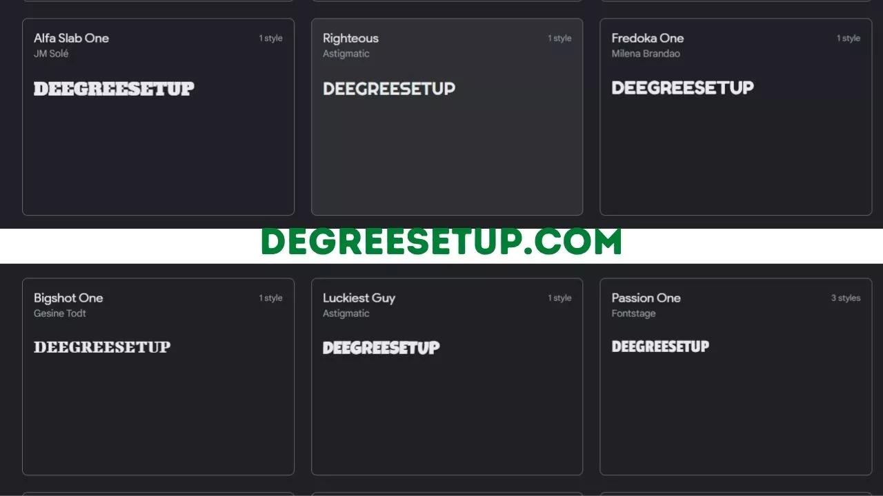
The best website logo font you can use for your website are.
Should your website logo match the content font?
It is not necessary to have the same font that your logo has. For example, you can use any bold font for your website logos, such as monotone and Poppins, for displaying your website content.
Make sure that the font you choose to display your content should be accessible to read, and use regular or textbook style to display the posts and articles. You can use font sizes between 16 px and 18 px to display your posts, but not less than that.
How often should you change your website logo?
Changing your brand’s logo is not recommended if it is already well established. However, you can make minor changes to make it look modern but avoid changing it completely.
Here are some of the things that you can change on your logo.
- Color.
- Dimension.
- Size.
FAQ about website logo font.
Should you use multiple fonts in a logo?
Use only one font to make your logo readable. Using various fonts can make your logo look unprofessional.
What are the best platforms for making a website logo?
Canva, Illustrator, and Figma are the top platforms used to make logos.


